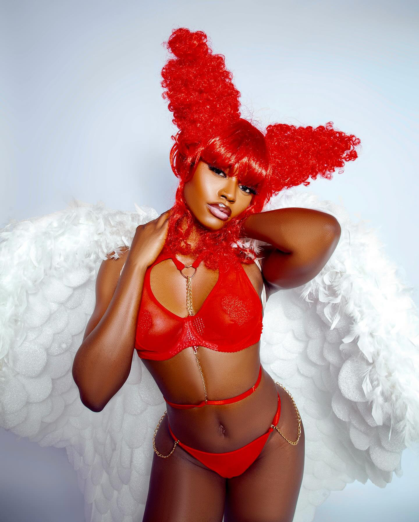

Client
Thorned Studio
Sector
Motion, Brand Identity, Art Direction
Industry
Fashion & Luxury
For Thorned, we moved beyond mood boards into movement. Every decision — from the grain of the footage to the weight of the typography — was driven by the idea that a brand should feel like a living thing.
Motion became the canvas — letting texture, light, and shadow tell a story that static imagery never could.
The creative direction for Thorned was built around contrast. Sharp, angular forms meet flowing organic textures. Light cuts through darkness. Nothing sits comfortably — and that was the point.
We developed a motion language that feels tactile and raw. Every frame was treated as a physical object — scratched, lit, and composed with the same attention a sculptor would give to stone.